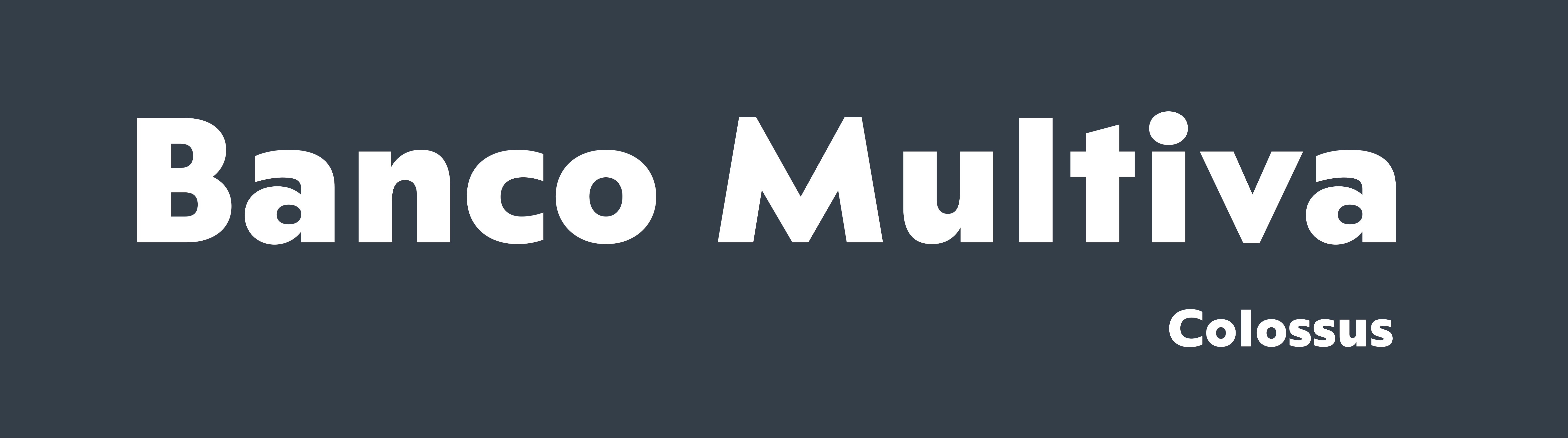
Multiva Sans
- year
- 2026
-
- designers
- Elí Castellanos, Antonio Mejía
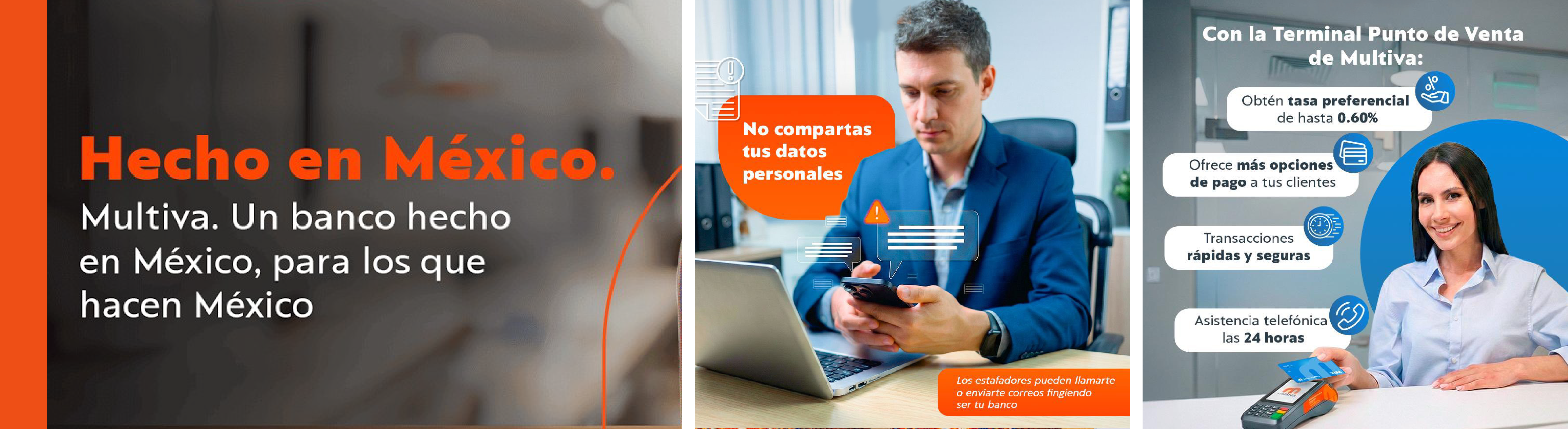
A typeface family developed for the rebranding of Multiva, a financial institution. With the brand redesign led by Forum Studio, the project focused on building a cohesive typographic system aligned with the bank’s evolution and future direction.
A typeface family developed for the rebranding of Multiva, a financial institution. With the brand redesign led by Forum Studio, the project focused on building a cohesive typographic system aligned with the bank’s evolution and future direction.

This project was developed in collaboration with LechugaType and involved customizing of our existing typeface Colossus. The typeface was selected as a foundation due to its strong compatibility with the logo’s shapes, effectively reinforcing the bank’s identity.
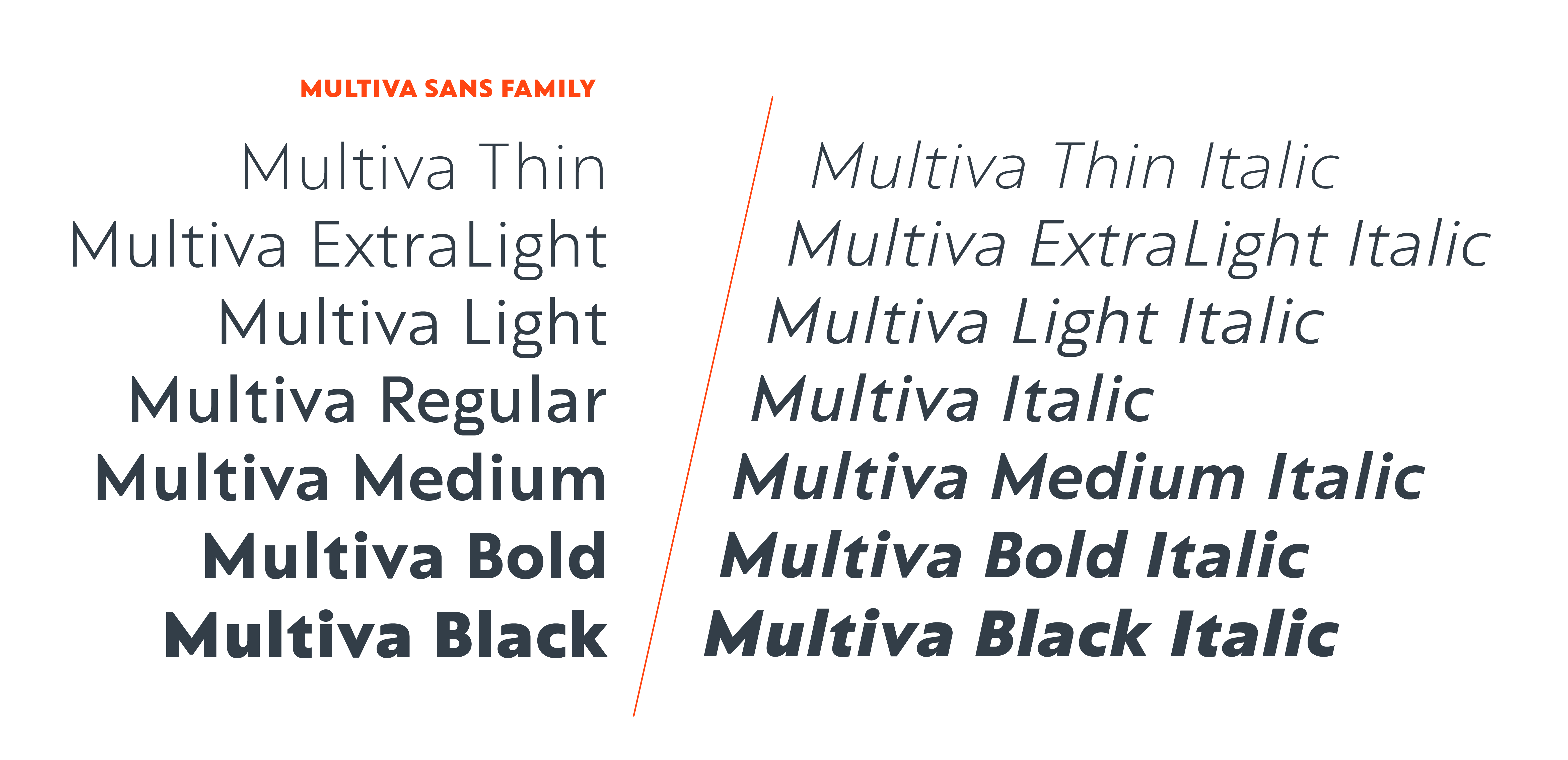
Adapted and expanded under the name Multiva Sans, it became an exclusive asset for the brand — a typeface family comprising seven weights with matching italics, designed to scale alongside the bank’s growth.
The process focused on preparing the typeface to perform across a wide range of scenarios, both in print and digital environments. First, we slightly increased the ascender proportions to improve readability in body text, particularly in long-form content such as contracts.
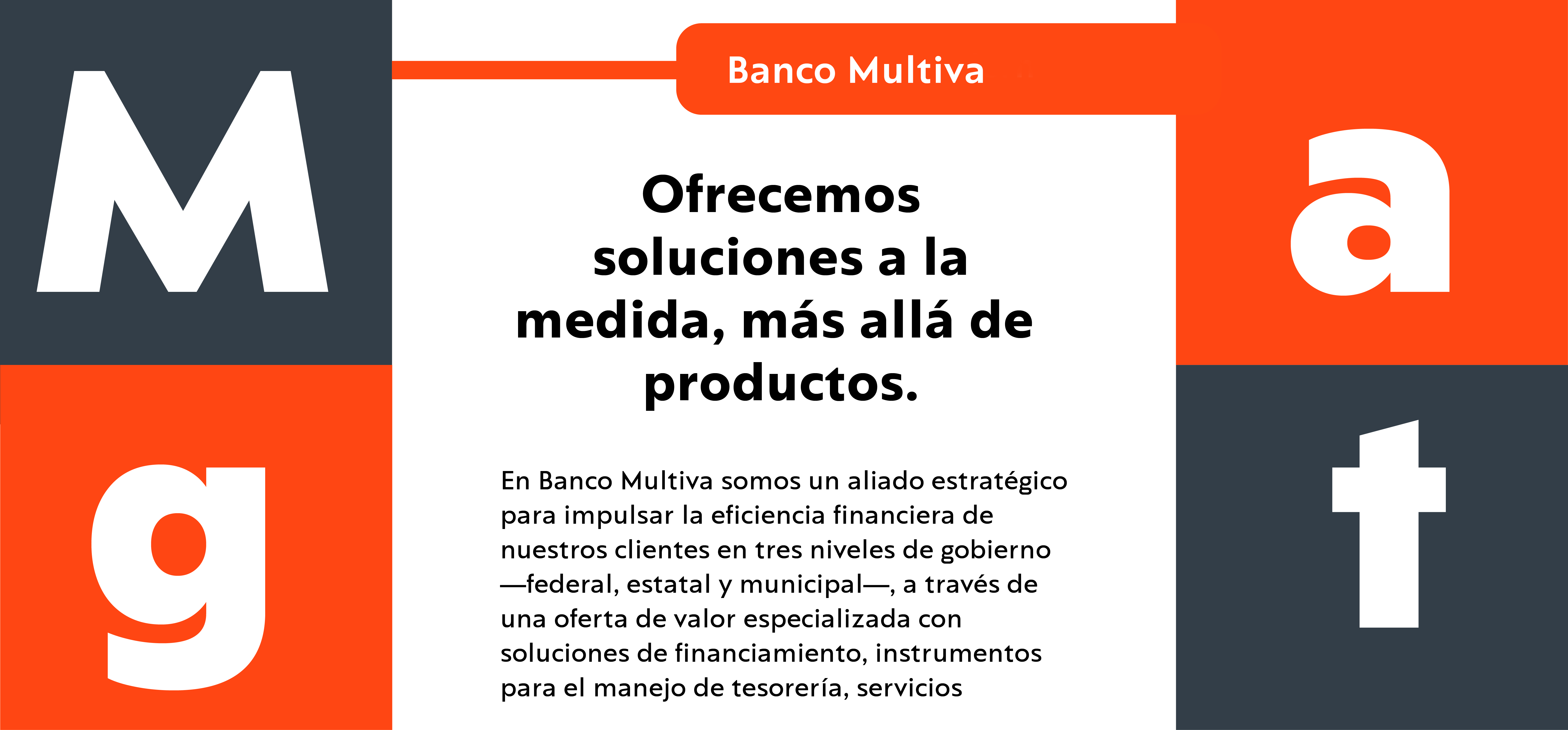
We then refined several key characters, including the /M/ — the bank’s flagship letter — as well as the /a/, /g/, and /t/, strengthening the typeface’s distinctive voice.
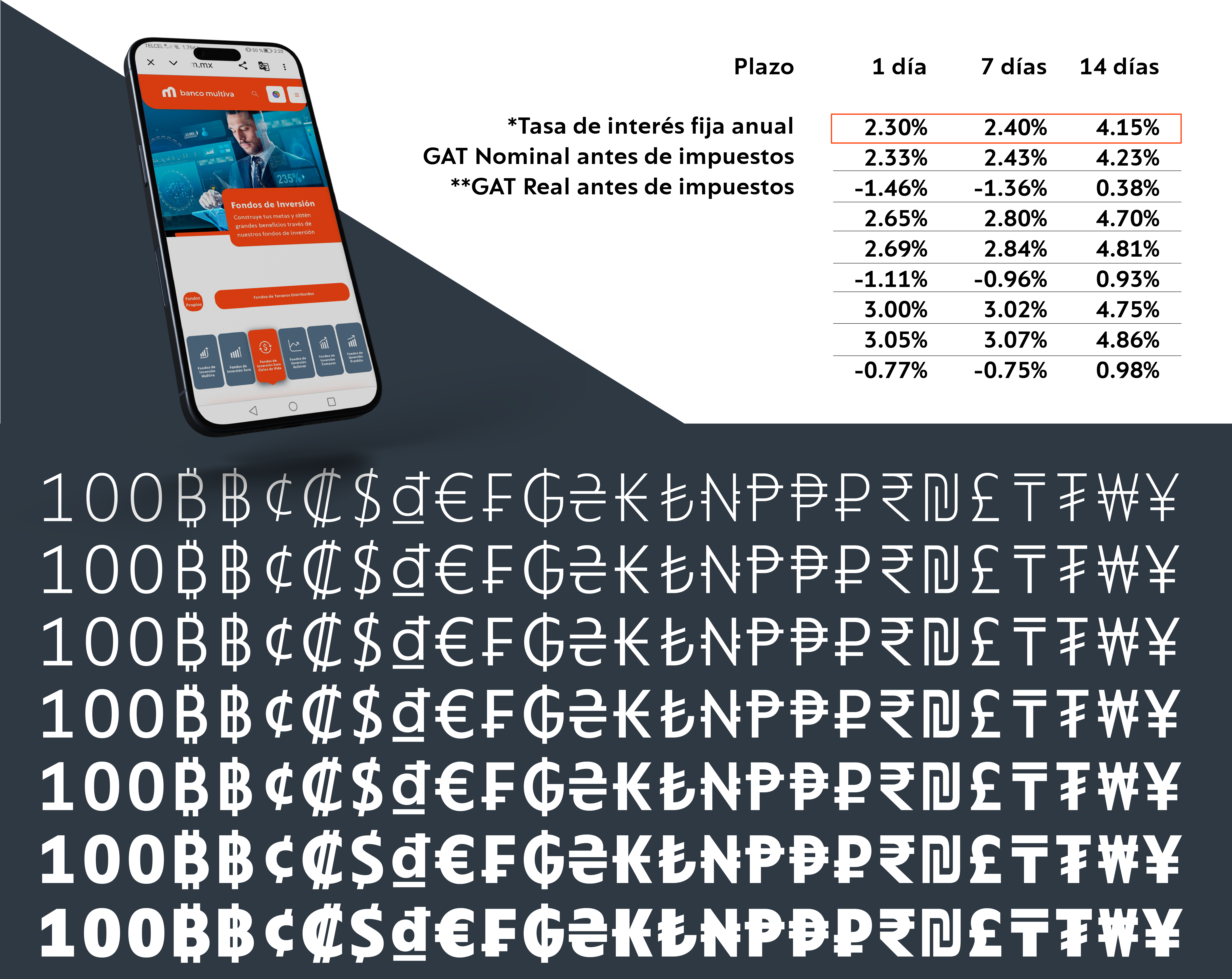
The character set was expanded to meet the bank’s diverse communication needs. We added tabular figures, currency and mathematical symbols, to ensure optimal performance in tables and financial documentation
Finally, given its digital focus, manual hinting was applied to optimize rasterization on Windows and Android, ensuring crisp and consistent screen rendering and a smaller file size.

The result is a robust and versatile typographic system that strengthens Multiva’s identity while ensuring clarity, consistency, and performance across all applications. Multiva Sans not only responds to the functional demands of a financial institution but also embodies the precision, reliability, and forward-looking vision that define the bank’s new era.