Carlos V
- year
- 2026
-
- Designer
- Jess Álamo
- Production
- Elí Castellanos
A custom typeface family for a personalized packaging campaign for Nestlé’s Carlos V brand. It expands the brand’s identity into a flexible two-variant OpenType system.
A custom typeface family for a personalized packaging campaign for Nestlé’s Carlos V brand. It expands the brand’s identity into a flexible two-variant OpenType system.
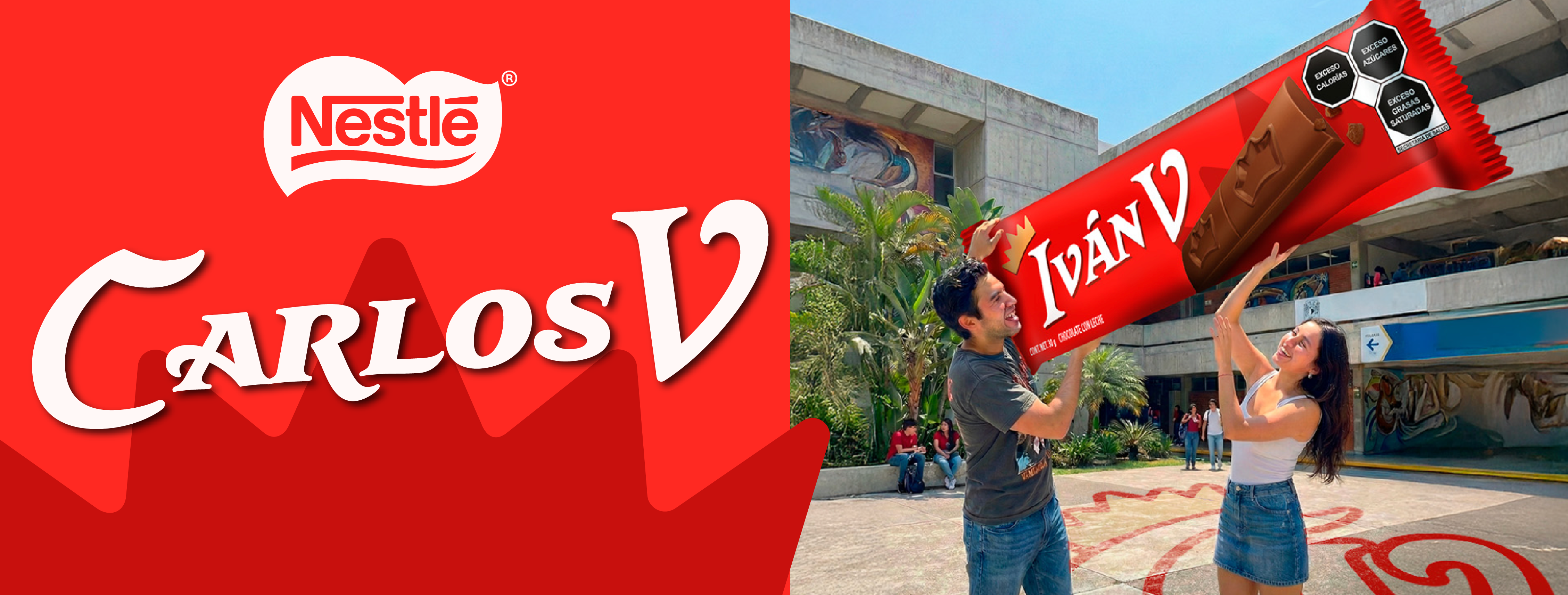
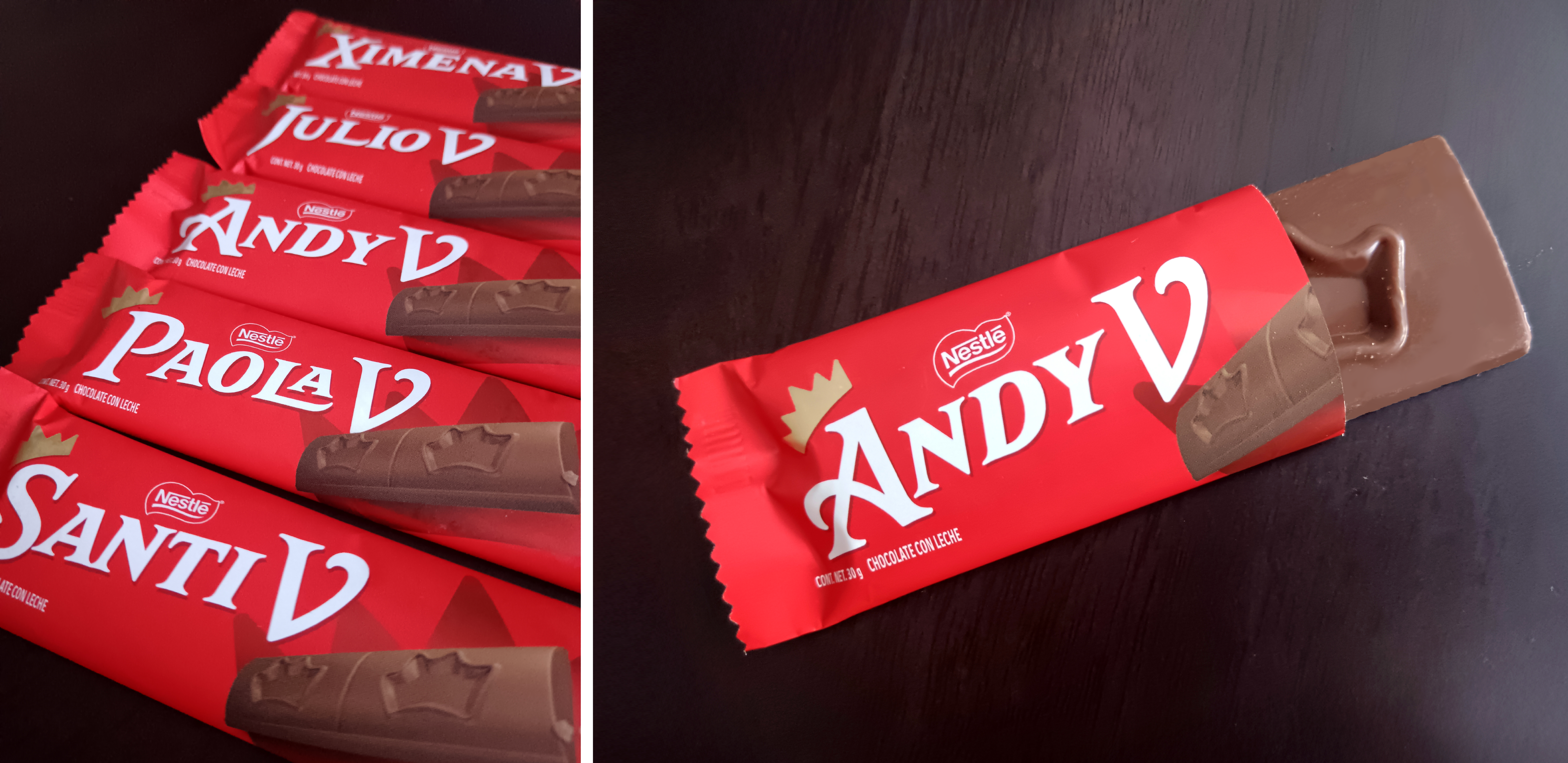
Carlos V is a custom typeface family developed for the Mexican chocolate brand Carlos V, part of Nestlé’s portfolio. Created for a campaign in which the chocolate packaging features individual names, the reinterpretation of the brand’s graphic identifier was led by Jess Álamo, with font production by Elí Castellanos.
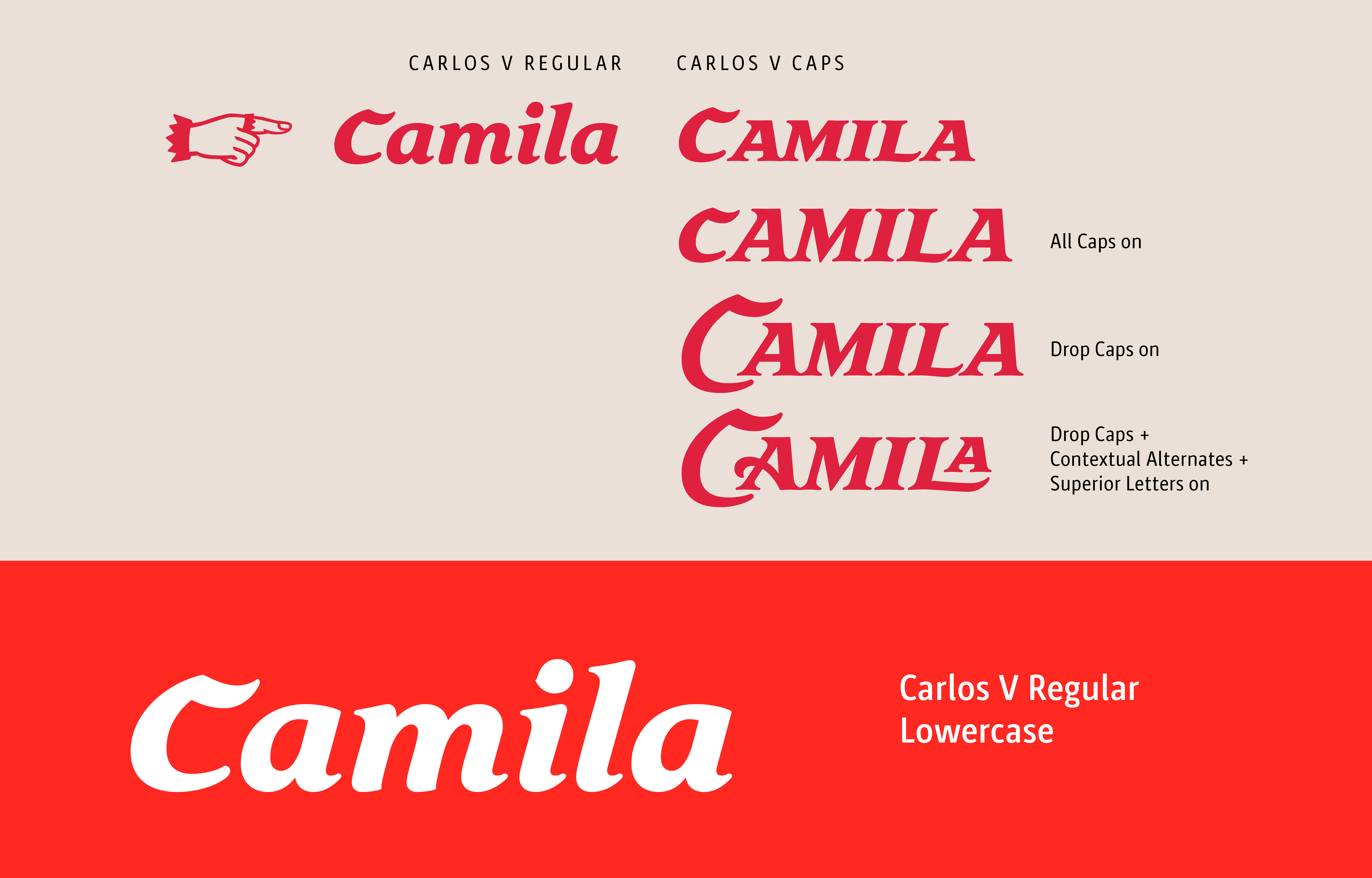
The family consists of two variants: Regular and Caps. The Regular version includes uppercase and lowercase characters, while Caps replaces lowercase with small caps, allowing for greater hierarchy and expressive control within the packaging system.
The character set comprises numerals, ligatures, basic punctuation, and mathematical symbols, ensuring functional versatility across applications.
The technical development, focused on making the typeface functional through advanced OpenType features. These include alternate forms, alternate drop caps, superior letters and a custom dingbat set containing manicules, a crown, the Nestlé logotype, a chocolate bar icon, and the brand’s slogan.
This extended functionality transformed the typeface into a dynamic tool, enabling richer typographic compositions while maintaining brand coherence.
The result is a robust and carefully engineered typographic system that elevates Carlos V’s identity, combining expressive character with technical precision to support the brand’s evolving narrative.